Performance and operational reporting is one of the key functions of the Information team at Worcestershire Acute Hospitals NHS Trust. All acute Trusts are monitored on a variety of performance related metrics, and regular reporting on performance against these key metrics is essential to support operational teams in achieving their targets.
Our role as an Information team includes regularly reviewing operational and performance reporting, and highlighting key trends, variations or anomalies in the data to operational colleagues. Causes of variation can then be identified and documented as part of our reporting, allowing us to build up insight into our performance data.
One method of building up this collective insight is simple: the Information team reviews performance reporting, notices a trend or point of interest in the data and raises it with operation colleagues, either by email or in a performance review meeting. The reasoning behind the variation is investigated and contextual information around the causes is provided by operational colleagues. This is then cascaded by email to all relevant stakeholders so that, going forward, the point of interest in the data is understood.
There are some inherent problems with this traditional method of collecting insight around reporting. If collected insight is not shared with all stakeholders, or new colleagues join the Trust, not all of the report audience have the same context when reviewing the data. Add in the human factor of forgetfulness when multitasking and monitoring dozens of key performance metrics, and teams may find themselves repeatedly querying the same previously explained variations in performance.
Implementing R as one of our business as usual tools, particularly the Shiny package, provides an alternative way of collecting and preserving insight into operational performance reporting. Below is an example of a report in Shiny, showing some dummy data on the Two-Week-Wait Referral to First Appointment cancer performance metric. In this instance, performance data has been charted using the SPC methodology, which makes outliers and variation easy to identify.
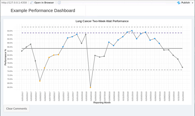
As an operational manager reviewing this report, I may know that the outlier at April 2018 was caused by a shortage of Two-Week-Wait clinic capacity because a clinician was on annual leave. This report has been set up so that the performance chart recognises click inputs. Double clicking on a data point triggers a modal dialog pop-up to appear. This modal reminds me of which data point I clicked on, and offers the opportunity to record a short comment explaining the variation.
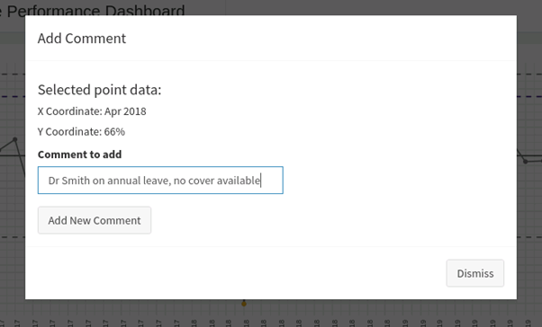
When I then click Okay, the modal dialogue box is dismissed, and the SPC chart refreshes. Behind the scenes, Shiny has sent an instruction to a SQL table in our data warehouse, where the captured comment has been stored along with information about which data point it relates to, and who has recorded the comment. When the SPC chart refreshes, my new comment is presented as an annotation which is available not just to me, but to all colleagues who view the report.
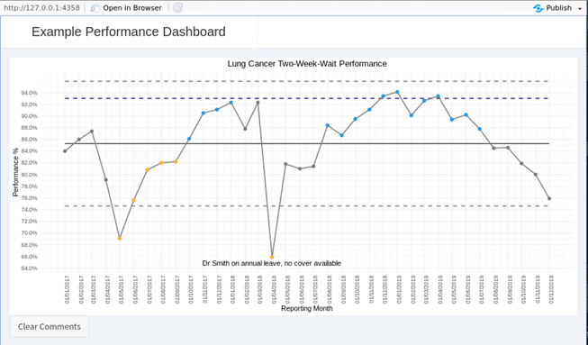
Colleagues from corporate support teams such as information, finance or workforce have immediate access to the reasons behind changes in the data. When presented at performance review meetings, the report contains added insight which can be understood even if the relevant operational manager is absent or leadership of a department has changed. It also prevents teams from wasting time querying or investigating variations in data which have been reviewed before.
Combining dynamic and intuitive user interfaces crafted in Shiny with data storage in SQL allows for valuable contextual insight to be captured and retained. In practice, our team have used this combination in setting up performance monitoring reports for activity levels during Phase 3 of Restoration of Services following the COVID-19 outbreak in March-2020. Part of restoration planning included modelling a number of interventions required to rebuild activity to historic levels. As Phase 3 progresses, the delivery of these interventions needs to be tracked to ensure that activity can be delivered. We used Shiny and SQL to set up an Intervention Tracking report, which displays all intended interventions and allows operational teams to record updates on delivery, building up a timeline of progress towards achieving their activity targets. In this way R allows one-way operational performance reporting to become a two-way exchange of insight.
The example code for the report above is available on my github at https://github.com/chrisreading01/2waybiexample.
Back to top