# 20240224 Added for qmd to run
library(ggplot2)
theme_set(theme_classic())
data("mtcars") # load data

mtcars$CarBrand <- rownames(mtcars) # Create new column for car brands and names

mtcars$mpg_z_score <- round((mtcars$mpg - mean(mtcars$mpg))/sd(mtcars$mpg), digits=2)

mtcars$mpg_type <- ifelse(mtcars$mpg_z_score <= 0, "below", "above")

mtcars <- mtcars[order(mtcars$mpg_z_score), ] #Ascending sort on Z Score
mtcars$CarBrand <- factor(mtcars$CarBrand, levels = mtcars$CarBrand)
Histograms (with auto binning)
Again, we will use the mtcars dataset and use the fields in that to produce the chart, as we are doing this there is nothing to do on the data preparation side. That leaves us to have fun with the plot.
Building the Histogram with auto binning
I set up the plot, as per below:
I import the ggplot2 library and set my chart theme to a classic theme. The process next is to create the histogram plot and feed in the relevant data:
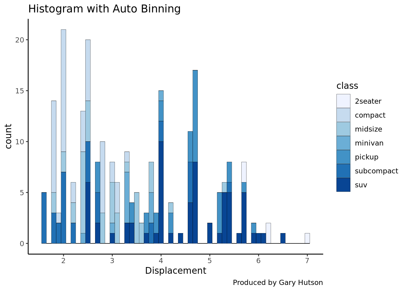
plot <- ggplot(mpg, aes(displ)) + scale_fill_brewer(palette = "Blues")I create a plot placeholder in memory so I can reuse this plot again and again in memory. This sets the aes layer equal to the displacement metric in the mtcars data frame. I then use the scale_fill_brewer command and select the palette to the Blues palette. A list of palettes can be found on the R Graph Gallery.
The next section uses the geom_histogram() geometry to force this to be a histogram:
plot + geom_histogram(aes(fill=class),
                      binwidth = .1,
                      col="black",
                      size=.1) +
  labs(title="Histogram with Auto Binning",
       caption="Produced by Gary Hutson") + xlab("Displacement")
The histogram uses the class of vehicle as the histogram fill, the binwidth is the width of the bins required, the colour is equal to black and the size is stipulated here. All that I then do is add the data labels to it and you have a lovely looking histogram built. This can be applied to any dataset. The output is as below:
Specifying binning values
The script can be simply changed in the histogram layer by adding the bins parameter:
plot + geom_histogram(aes(fill=class),
                   bins=5,
                   col="black",
                   size=.1) +
  labs(title="Histogram with Auto Binning",
       caption="Produced by Gary Hutson") + xlab("Displacement")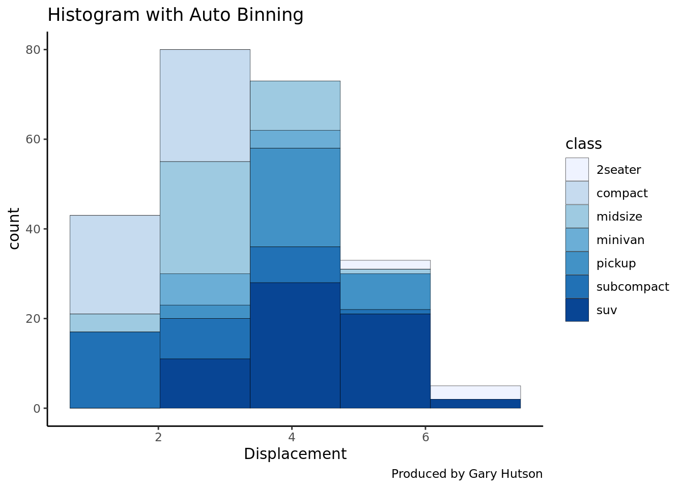
This blog was written by Gary Hutson, Principal Analyst, Activity & Access Team, Information & Insight at Nottingham University Hospitals NHS Trust, and was originally posted on Hutsons-Hacks.
Reuse
CC0
Citation
For attribution, please cite this work as:
Hutson, Gary. 2018. “Histogram with Auto Binning in
Ggplot2.” May 24, 2018. https://nhs-r-community.github.io/nhs-r-community//blog/histogram-with-auto-binning-in-ggplot2.html.