“Writing functions to reduce repetition and improve productivity”
Functions
Data
Author
Tom Jemmett
Published
January 30, 2020
Modified
July 11, 2024
One of the greatest benefits of using R over spreadsheets is that it’s very easy to re-use and repurpose code, for example if we need to produce the same chart over and over again, but for different cuts of the data.
Let’s imagine that we are trying to create a plot for arrivals to A&E departments using the ae_attendances dataset from the {NHSRdatasets} package.
Creating our first plot
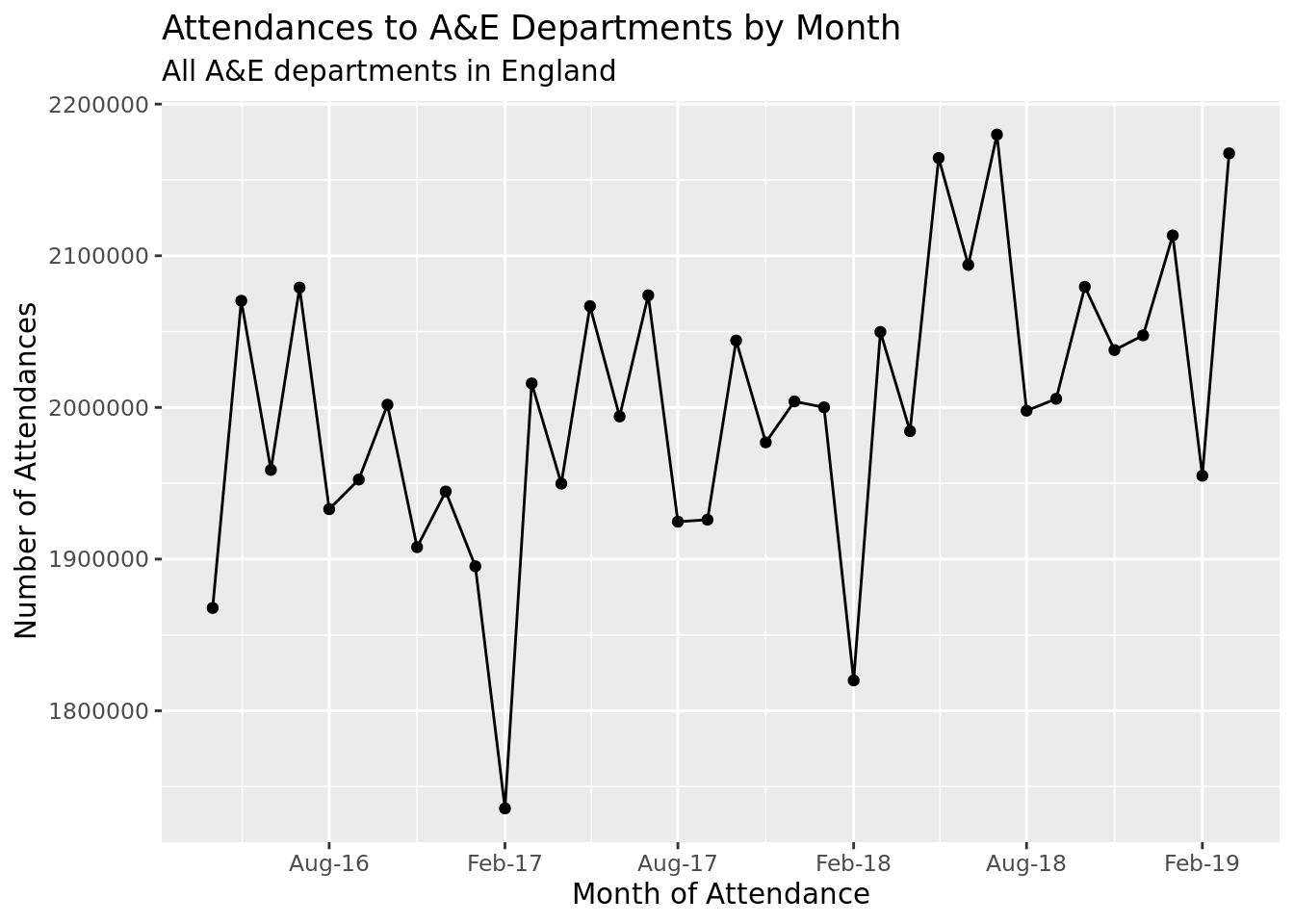
First we want to create a plot for all of England’s A&E departments over the last 3 financial years.
library(tidyverse)library(NHSRdatasets)ae_attendances%>%group_by(period)%>%# summarise at is a shorthand way of writing something like# summarise(column = function(column))# first you specify the columns (one or more) in the vars() function (short# for variables), followed by the function that you want to use. You can# then add any additional arguments to the function, like below I pass# na.rm = TRUE to the sum function.summarise_at(vars(attendances), sum, na.rm =TRUE)%>%ggplot(aes(period, attendances))+geom_point()+geom_line()+scale_x_date(date_breaks ="6 months", date_labels ="%b-%y")+labs( x ="Month of Attendance", y ="Number of Attendances", title ="Attendances to A&E Departments by Month", subtitle ="All A&E departments in England")
Creating a second plot
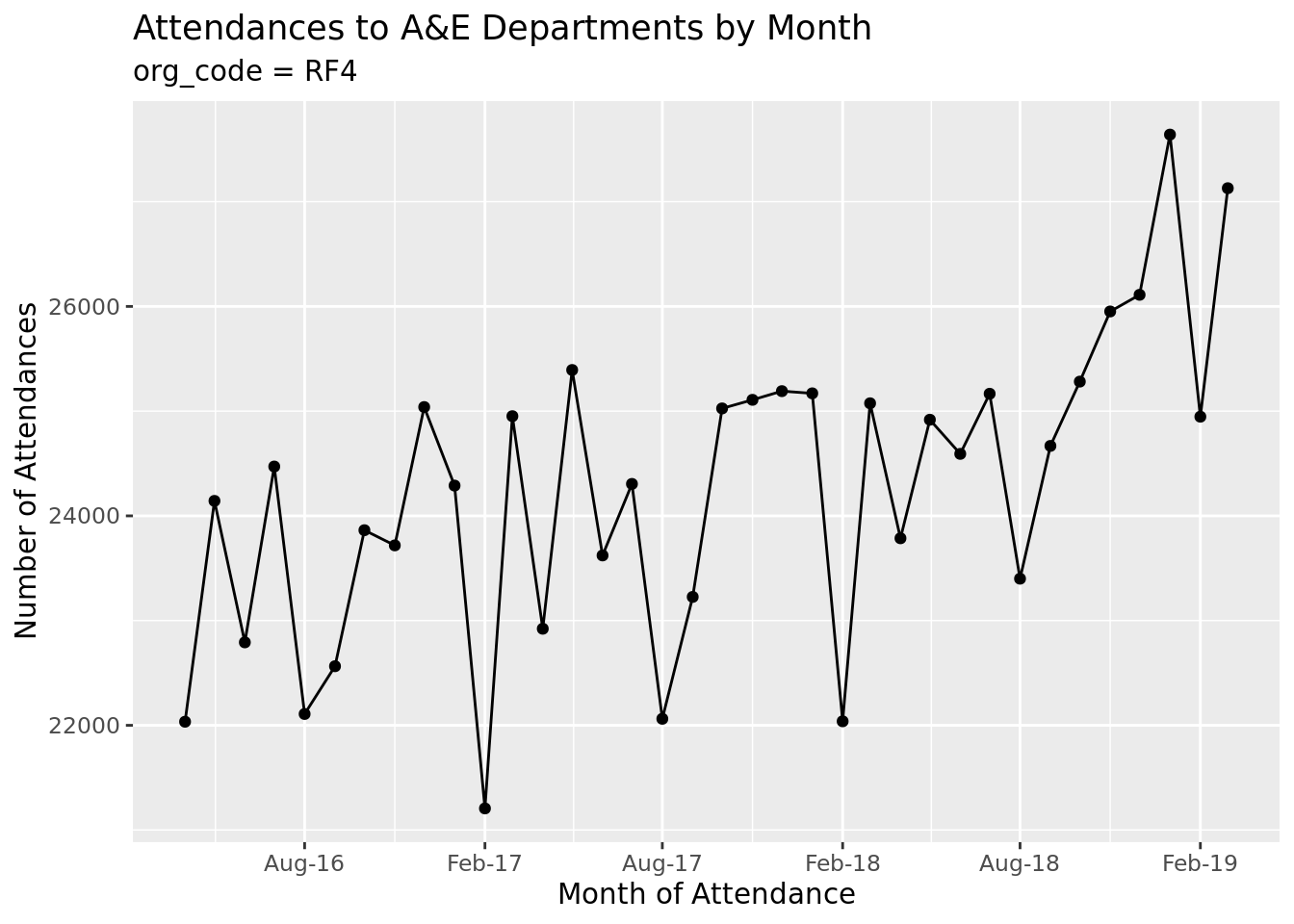
Now, what if we wanted to run this for just a single trust? We could copy and paste the code, then add in a filter to a specific trust.
# of course, you would usually more specifically choose which organisation we# are interested in! Selecting the first organisation for illustrative purposes.# The pull function grabs just the one column from a data frame, we then use# head(1) to select just the first row of data, and finally ensure that we# convert this column from a factor to a characterfirst_org_code<-ae_attendances%>%pull(org_code)%>%head(1)%>%as.character()ae_attendances%>%filter(org_code==first_org_code)%>%group_by(period)%>%summarise_at(vars(attendances), sum)%>%ggplot(aes(period, attendances))+geom_point()+geom_line()+scale_x_date(date_breaks ="6 months", date_labels ="%b-%y")+labs( x ="Month of Attendance", y ="Number of Attendances", title ="Attendances to A&E Departments by Month", subtitle =paste("org_code =", first_org_code))
So, what changed between our first plot and the second? Well, we’ve added a line to filter the data, and changed the subtitle, but that’s it. The rest of the code is repeated.
Creating yet another copy of the first plot
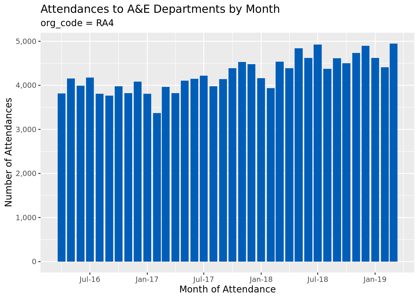
Let’s say we want to run this code again and create a plot for another organisation. So again, let’s copy and paste.
But perhaps at this point we also decide that we want the label’s on the y-axis to use comma number formatting, we want to change the dots and lines to bars, and we want to colour the bars in NHS Blue.
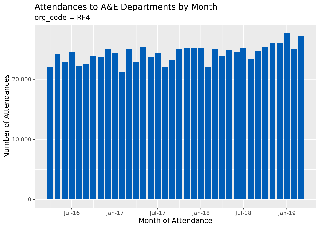
# the scales package has nice functions for neatly formatting chart axeslibrary(scales)# again, just selecting an organisation for illustrative purposes only.# This time, we use tail instead of head to select the final rowsecond_org_code<-ae_attendances%>%pull(org_code)%>%tail(1)%>%as.character()ae_attendances%>%filter(org_code==second_org_code)%>%group_by(period)%>%summarise_at(vars(attendances), sum)%>%ggplot(aes(period, attendances))+geom_col(fill ="#005EB8")+scale_x_date(date_breaks ="6 months", date_labels ="%b-%y")+scale_y_continuous(labels =comma)+labs( x ="Month of Attendance", y ="Number of Attendances", title ="Attendances to A&E Departments by Month", subtitle =paste("org_code =", second_org_code))
Now, we want to go back and change the rest of the plots to have the same look and feel. Well, you will have to go back up and change those plots individually, which when there’s just 3 plots then so what? It’s easy enough to go back and change those!
But what if it’s 300 plots? Or, what if those 3 plots are in 3 different places in a very large report? What if those 3 plots are in separate reports? What if it wasn’t just a handful of lines code we are adding but lots of lines?
Creating functions
This is where we should start to think about extracting the shared logic between the different plot’s into a function. This is sometimes called “DRY” for “Don’t Repeat Yourself”. Where possible we should aim to eliminate duplication in our code.
In R it’s pretty simple to create a function. Here’s a really simple example:
my_first_function<-function(x){y<-3*xy+1}
This creates a function called my_first_function: you assign functions just like any other variable in R by using the <- assignment operator. You then type the keyword function which is immediately followed by a pair of parentheses. Inside the parentheses you can name “arguments” that the function takes (zero or more), then finally a set of curly brackets, { and }, which contain the code you want to execute (the function’s body).
The functions body can contain one or more lines of code. Whatever line of code is executed last is what is returned by the function. In the example above, we first create a new variable called y, but we return the value of y + 1.
The values that we create inside our function (in this case, y) only exist within the function, and they only exist when the function is called (so subsequent calls of the function don’t see previous values).
We can then simply use our function like so:
my_first_function(3)
[1] 10
Which should show the value “10” in the console.
Converting our plot code to a function
The first thing we should look to do is see what parts of the code above are identical, which parts are similar but change slightly between calls, and which parts are completely different.
For example, in our plot above, each example uses the same data summarisation, and the same call to {ggplot}. We slightly changed how we were displaying our charts (we started off with geom_point() and geom_line(), but changed to geom_col() in the third plot). Let’s go with the chart used in the third version as our base plot.
The subtitle’s differ slightly between the 3 plots, but we could extract this to be an argument to the function. So my first attempt at converting this plot to a function might be:
ae_plot<-function(data, subtitle){data%>%group_by(period)%>%summarise_at(vars(attendances), sum)%>%ggplot(aes(period, attendances))+geom_col(fill ="#005EB8")+scale_x_date(date_breaks ="6 months", date_labels ="%b-%y")+scale_y_continuous(labels =comma)+labs( x ="Month of Attendance", y ="Number of Attendances", title ="Attendances to A&E Departments by Month", subtitle =subtitle)}
We can now create our first 3 plots as before:
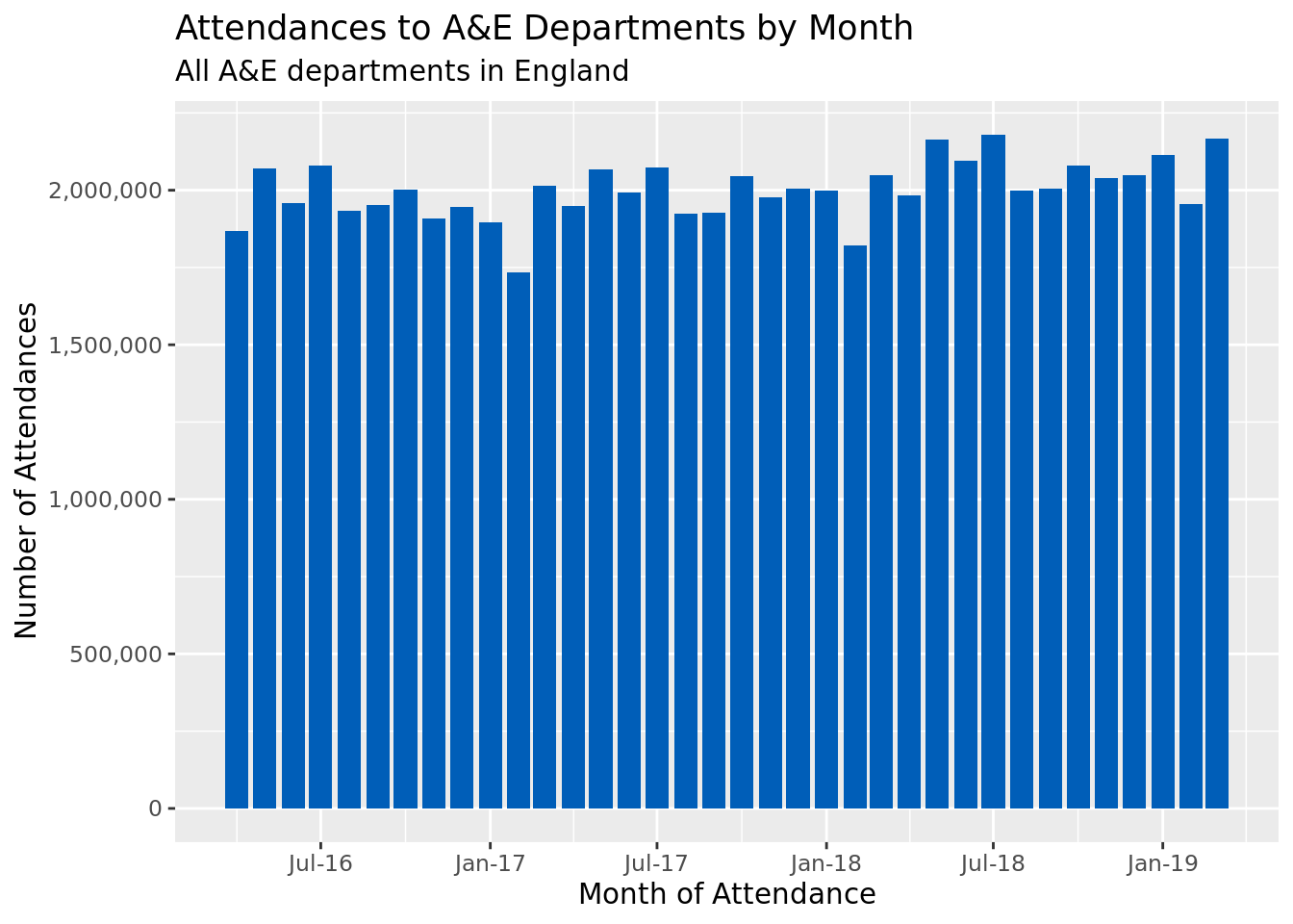
ae_plot(ae_attendances, "All A&E departments in England")
# as ae_plot's first argument is the data, we can use the %>% operator to pass in the data like so:ae_attendances%>%filter(org_code==first_org_code)%>%ae_plot(paste("org_code =", first_org_code))
Now, we’ve managed to remove most of the duplication in our code! If we decide we no longer like the blue points and line we can easily change the function, or if we want to switch to a bar chart instead of the line chart we only have to update the code once; when we re-run our code all of the plots will change.
Of course, this leads to it’s own problems: what if we want 3 charts to have blue points but one use red? We could either add a colour argument to the function, or we could remove the logic which adds the points and lines to the chart but does everything else: then we could just add the points on at the end (or, create a red function and a blue function; each function would first call the main function before doing their own stuff).
In Summary
Functions allow us to group together sections of code that are easy to reuse, they make our code easier to maintain, because we only have to update code in one place, and they reduce errors by limiting the amount of code we have.
Further Reading
This file was generated using RMarkdown, you can grab the .Rmd file as a GitHub gist.
Hopefully this has been a useful introduction to functions, if you are interested in learning more then the R4DS book has an excellent chapter on functions.
Once you have mastered writing functions then you might want to read up on tidyeval: this allows you to write functions like you find in the {tidyverse} where you can specify the names of columns in dataframes.
You may also want to have a go at object orientated programming, which is covered in the Advanced R book.
Any time you see yourself copying and pasting code try to remember, Don’t Repeat Yourself!
Tom is a Senior Data Scientist working at the Strategy Unit.