library(tidyverse)
set.seed(2020) # set the random number seed to ensure you can replicate this example
y <- rnorm(30, 0, 1) # generate 30 random numbers for the y-axis
y <- c(y, rep(NA, 10)) # add 10 NAs to extend the plot (see later)
x <- 1:length(y) # generate the x-axis
df <- tibble(x = x, y = y) # store as a tibble data frame for convenienceStatistical Process Control (SPC) charts are widely used in healthcare analytics to examine how the metric varies over time and whether this variation is abnormal. Christopher Reading has already published a blog on SPC Charts.
Here is a simple example of annotating points and text on SPC plots using {ggplot2} package. We won’t explain all the parameters in the annotate function. Instead we see this as a short show and tell piece with signposts at end of the blog.
So let’s get started and generate some dummy data from a normal distribution with a mean of 0 and and a standard deviation of 1.
Now we can plot the data using {ggplot} function.
fig1 <- ggplot(df, aes(x, y)) +
  geom_point(size = 2) +
  geom_line() +
  ylim(-4, 4) # increase the y-axis range to aid visualisation

fig1 # plot the data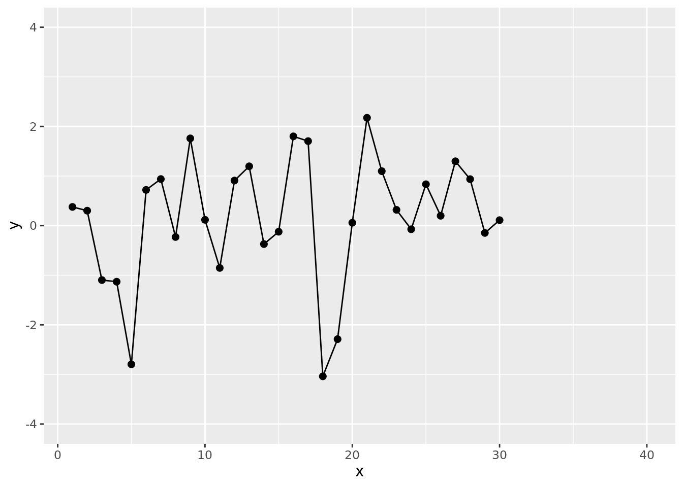
One of the main features of SPC charts are upper and lower control limits. We can now plot this as an SPC chart with lower and upper control limits set at 3 standard deviations from the mean. Although in practice the calculation of control limits differs from this demo, for simplicity we imply control limits and a mean as set numbers. Alternatively, you could use {qicharts2} package to do SPC calculations and then use the generated {ggplot2} object and keep following our steps.
fig1 <- fig1 +
  geom_hline(yintercept = c(3, 0, -3), linetype = "dashed") + # adds the upper, mean and lower lines
  annotate("label",
    x = c(35, 35, 35),
    y = c(3, 0, -3),
    color = "darkgrey",
    label = c("Upper control limit", "Average line", "Lower control limit"),
    size = 3
  ) # adds the annotations

fig1 # plot the SPC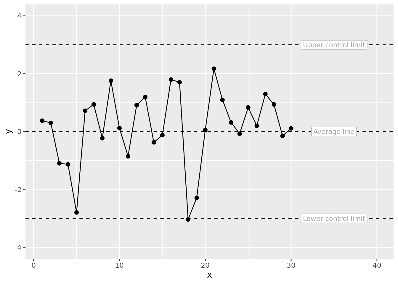
Remarkably we see a point below the lower control limit even though the data are purely pseudo-random. A nice reminder that control limits are guidelines not hard and fast tests of non-randomness. We can now highlight this remarkable special cause data point which is clearly a false signal also known as special cause variation.
fig1 <- fig1 +
  annotate("point", x = 18, y = df$y[18], color = "orange", size = 4) +
  annotate("point", x = 18, y = df$y[18])

fig1 # plot the SPC with annotations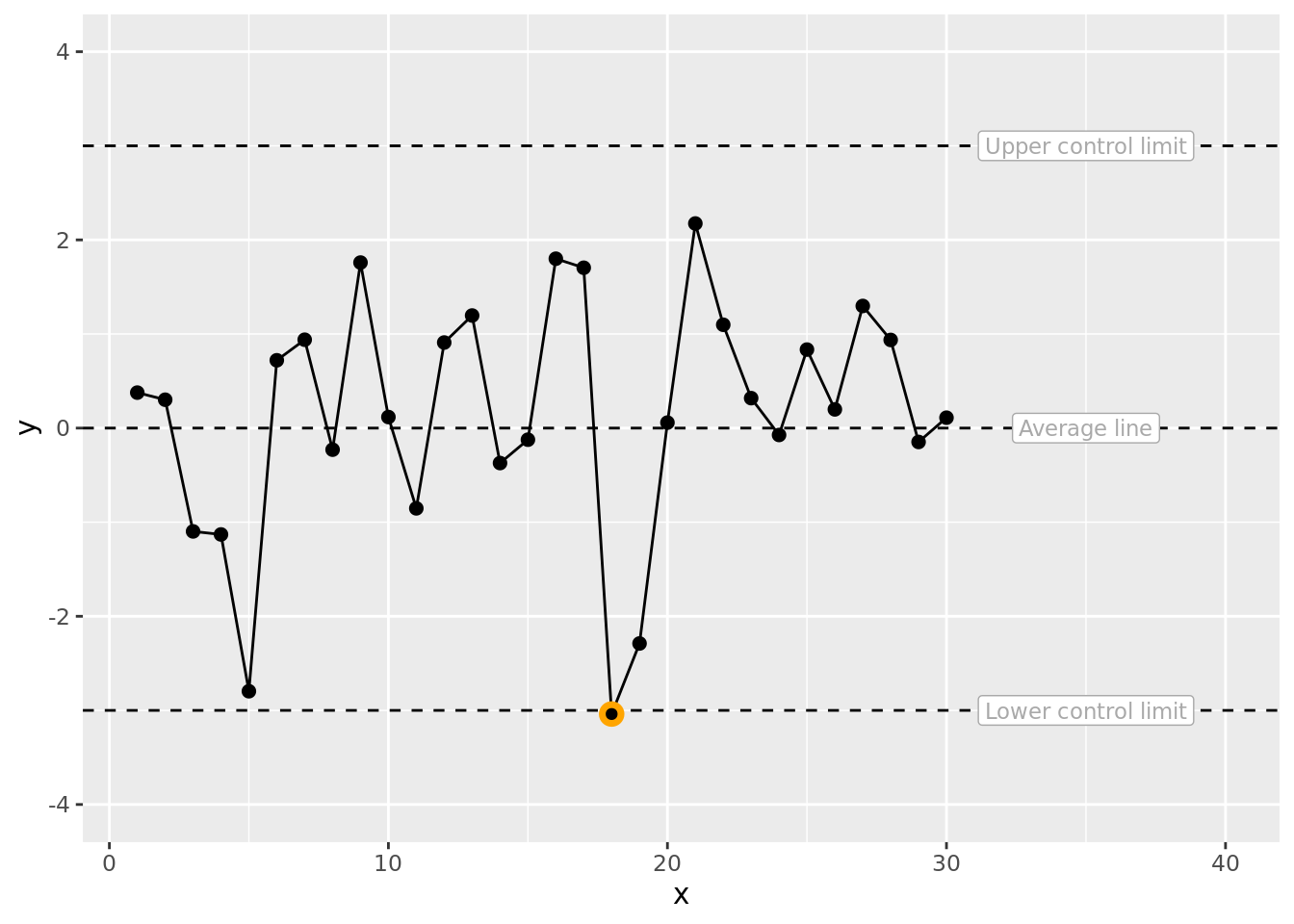
We can now add a label for the special cause data point. You can play around with the vjust value (for example try -1, 0, 1) to get a feel for what it is doing to the vertical position of the label. There is also a hjust which operates on the horizontal plane.
fig1 <- fig1 +
  annotate("label", x = 18, y = df$y[18], vjust = 1.5, label = "Special cause variation", size = 3)

fig1 # plot the SPC with more annotations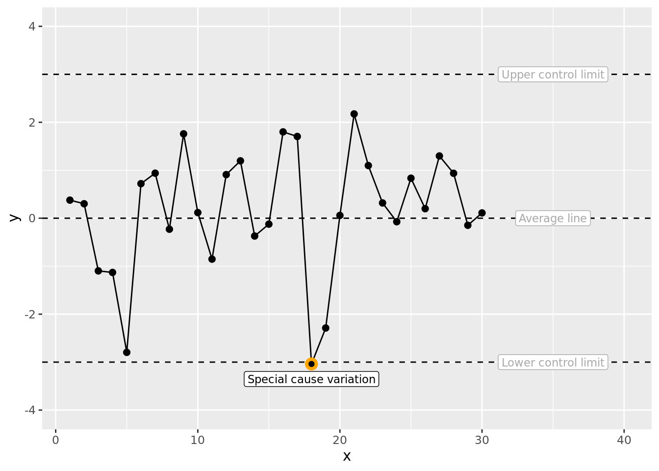
To learn more about the annotate function see https://ggplot2.tidyverse.org/reference/annotate.html
This blog has been formatted to remove Latin Abbreviations and edited for NHS-R Style
Back to topReuse
CC0
Citation
For attribution, please cite this work as:
Reading-Skilton, Christopher. 2020. “Annotating SPC Plots Using
Annotate with Ggplot.” August 13, 2020. https://nhs-r-community.github.io/nhs-r-community//blog/annotating-spc-plots-using-annotate-with-ggplot.html.