library(readxl)
url <- "https://www.ons.gov.uk/file?uri=/peoplepopulationandcommunity/populationandmigration/populationprojections/datasets/clinicalcommissioninggroupsinenglandtable3/2018based/table3.xls"
destfile <- "table3.xls"
curl::curl_download(url, destfile)

males <- read_excel(destfile, sheet = "Males", skip = 6) |> dplyr::mutate(gender = "Male")
females <- read_excel(destfile, sheet = "Females", skip = 6) |> dplyr::mutate(gender = "Female")
df <- rbind(males, females)
Update to data
Since the blog was published populations statistics are available from 2018 and CCG names have changed. The blog text refers to the previous estimates from 2016 and three CCGs but the code is from 2018 and for only 2 CCGs.
Even in my relatively short experience of working as healthcare analyst, I have massively used population pyramids to describe the local population and how it may change according to ONS population projections. So, I decided to try animated pyramids in R. The overall process for me includes:
1. Wrangle data a bit to make it ready for {ggplot2}.
2. Build 1 pyramid and see how it will look.
3. Create animation with 25 pyramids for period 2016 – 2041 using different animation packages and compare them.
In this part I will consider only first 2 steps.
Change the data
I probably should have said earlier, but I am not an expert in R (actually, I feel like I’m still a perpetual novice). On data wrangling stage, I created datasets for almost each step of the data transformation. It made easier for me to check for errors but made my code a bit ugly.
I used the open-source data from the Office for National Statistics. It has population estimates for mid-2016 and population projections by age and gender for England and CCGs. I separately saved worksheets ‘Females’ and ‘Males’ and loaded them in RStudio. I then just added gender column in both datasets and combined this two data sets by rbind(). Overall, data wrangling process should make this:
##    year `AGE GROUP` gender population totalyears percentage
## 1  2016       0-4 Female       41.1     1167.5   3.520343
## 2  2016     05-09 Female       39.5     1167.5   3.383298
## 3  2016     10-14 Female       36.4     1167.5   3.117773
## 4  2016     15-19 Female       39.6     1167.5   3.391863
## 5  2016     20-24 Female       49.6     1167.5   4.248394
## 6  2016     25-29 Female       44.2     1167.5   3.785867
## 7  2016     30-34 Female       39.8     1167.5   3.408994
## 8  2016     35-39 Female       38.1     1167.5   3.263383
## 9  2016     40-44 Female       35.6     1167.5   3.049251
## 10 2016     45-49 Female       38.5     1167.5   3.297645
from this:
read_excel(destfile, sheet = "Females") |> head(10)# A tibble: 10 × 29
2018-based subnational …¹ ...2 ...3 ...4 ...5 ...6 ...7 ...8
<chr> <chr> <chr> <dbl> <dbl> <dbl> <dbl> <dbl>
1 Table 3: 2018-based Subn… <NA> <NA> NA NA NA NA NA
2 Females by 5 year age gr… <NA> <NA> NA NA NA NA NA
3 <NA> <NA> <NA> NA NA NA NA NA
4 Figures in units (to one… <NA> <NA> NA NA NA NA NA
5 <NA> <NA> <NA> NA NA NA NA NA
6 CODE AREA AGE … 2018 2019 2020 2021 2022
7 E92000001 Engl… 0-4 1630474 1607341 1586496 1560569 1539989
8 E92000001 Engl… 5-9 1719932 1728416 1728980 1724499 1703291
9 E92000001 Engl… 10-14 1596348 1637137 1677733 1710446 1744902
10 E92000001 Engl… 15-19 1506704 1502982 1514822 1545190 1590329
# ℹ abbreviated name: ¹`2018-based subnational population projections`
# ℹ 21 more variables: ...9 <dbl>, ...10 <dbl>, ...11 <dbl>, ...12 <dbl>,
# ...13 <dbl>, ...14 <dbl>, ...15 <dbl>, ...16 <dbl>, ...17 <dbl>,
# ...18 <dbl>, ...19 <dbl>, ...20 <dbl>, ...21 <dbl>, ...22 <dbl>,
# ...23 <dbl>, ...24 <dbl>, ...25 <dbl>, ...26 <dbl>, ...27 <dbl>,
# ...28 <dbl>, ...29 <dbl>Let’s see it step by step:
For the simplicity, I left only area I need for now. In 2016, Birmingham and Solihull CCG were three different CCGs.
# df1 <- subset(persons, df$AREA == "NHS Birmingham CrossCity CCG" | df$AREA == "NHS Birmingham South and Central CCG" | df$AREA == "NHS Solihull CCG")

# CCG names have changed since first posting of blog
df1 <- subset(df, df$AREA == "NHS Birmingham and Solihull CCG" | df$AREA == "NHS Sandwell and West Birmingham CCG")
My data still has columns for each year separately, so I created column ‘year’ and changed data structure
Superseded function
gather()
gather()has been superseded in {tidyr} part of {tidyverse} and it a message may appear to suggest using pivot_longer(). The code will still run but there will be no development or maintenance for this function.
library(tidyr)
# df2 <- gather(df1, "year", "population", 4:29)
df2 <- pivot_longer(df1, cols = 4:29,
                    names_to = "year",
                    values_to = "population")

print(df2, n = 10)
# A tibble: 2,080 × 6
CODE AREA `AGE GROUP` gender year population
<chr> <chr> <chr> <chr> <chr> <dbl>
1 E38000144 NHS Sandwell and West Birmingh… 0-4 Male 2018 19007
2 E38000144 NHS Sandwell and West Birmingh… 0-4 Male 2019 18803
3 E38000144 NHS Sandwell and West Birmingh… 0-4 Male 2020 18578.
4 E38000144 NHS Sandwell and West Birmingh… 0-4 Male 2021 18219
5 E38000144 NHS Sandwell and West Birmingh… 0-4 Male 2022 17923.
6 E38000144 NHS Sandwell and West Birmingh… 0-4 Male 2023 17780.
7 E38000144 NHS Sandwell and West Birmingh… 0-4 Male 2024 17794
8 E38000144 NHS Sandwell and West Birmingh… 0-4 Male 2025 17790.
9 E38000144 NHS Sandwell and West Birmingh… 0-4 Male 2026 17802.
10 E38000144 NHS Sandwell and West Birmingh… 0-4 Male 2027 17841.
# ℹ 2,070 more rowsBoring but important bits: aggregate data by year, age band and gender, change population column to numeric format and drop the row ‘All Ages’ to not accidentally include it in our plot
df2$population <- as.numeric(df2$population)
df3 <- aggregate(population ~ `AGE GROUP` + gender + year, data = df2, FUN = sum)
df3 <- df3[df3$`AGE GROUP` != "All ages", ]
Now, let’s calculate percentages. For standard population pyramids percentages are calculated from total population for the year, so we should calculate this value, add to the table and calculate percentage for each gender-age band pair.
totalyear <- aggregate(population ~ year, data = df3, FUN = sum)
df4 <- merge(x = df3, y = totalyear, by = "year", all.x = TRUE)
colnames(df4)[colnames(df4) == "population.y"] <- "totalyears"
colnames(df4)[colnames(df4) == "population.x"] <- "population"
df4$percentage <- df4$population / df4$totalyears * 100

# This version of import requires the age groups to be a factor to be ordered:
df4$`AGE GROUP` <- factor(df4$`AGE GROUP`,
                          levels =
                            c("0-4",
                          "5-9",
                          "10-14",
                          "15-19",
                          "20-24",
                          "25-29",
                          "30-34",
                          "35-39",
                          "40-44",
                          "45-49",
                          "50-54",
                          "55-59",
                          "60-64",
                          "65-69",
                          "70-74",
                          "75-79",
                          "80-84",
                          "85-89",
                          "90+" ))
To draw population pyramids in Excel, I always used negative values for one of the genders and then changed the legend. I used the same logic for R
Last but not least, I notices ‘X’ in front of the year. Let’s remove it!
Commented out this last section as it removes the first two characters and this data import does not have the X added
# df4$year <- substr(df4$year, 2, 5) Drawing pyramid
Now, when our data looks tidy and ready, we can move to the the most exciting part – using {ggplot2}. The main thing in this process are: build bar chart, flip axes and use the theme we would like. I could not resist and used The Strategy Unit colours!
library(ggplot2)
ggplot(subset(df4, df4$year == "2018"),
       aes(x = `AGE GROUP`,
           y = percentage,
           fill = gender)) +   # Fill column
  geom_bar(stat = "identity", width = .85) +   # draw the bars
  scale_y_continuous(breaks = seq(-5,5, length.out = 11),
                     labels = c('5%','4%', '3%', '2%', '1%', '0', '1%','2%','3%','4%','5%')) +
  coord_flip() +  # Flip axes
  labs(title = "Birmingham and Solihull population",
       y = "percentage of populaiton",
       x = "Age group") +
  theme(plot.title = element_text(hjust = .5),
        axis.ticks = element_blank(),
        panel.background = element_blank(),
        strip.background = element_rect(colour="white",
                                        fill="white"),
        strip.text.x = element_text(size = 10)) +   # Centre plot title
  scale_fill_manual(values = c("goldenrod2", "gray32")) + ###colours of Strategy Unit+
  facet_grid(. ~ year)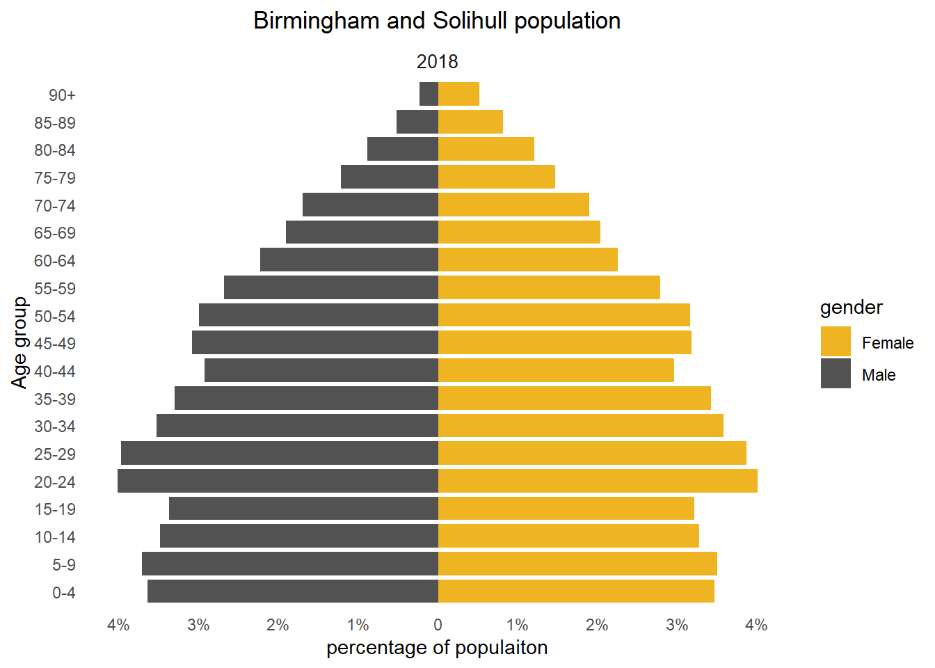
To be continued…
As I previously said, my main aim of this exersice was to learn R animation and compare different packages. So far I have used packages {magick} and {gganimate} and am happy to share results in the next part. Please do not hesitate to leave your comment and suggest any other packages for creating animation, I want to test them all!
This blog has been edited for NHS-R Style.
Reuse
CC0
Citation
For attribution, please cite this work as:
Zharinova, Anastasiia. 2019. “Animated Population Pyramids in R:
Part 1.” March 12, 2019. https://nhs-r-community.github.io/nhs-r-community//blog/animated-population-pyramids-in-r-part-1.html.