The problem
I was working with a dataset where I wanted to assess the correlation of different variables in R. As much as I like R – the outputs from the console window leave something to be desired (in terms of data visualisation). Therefore, I wanted a way to visualise these correlations in a nicer / cleaner / crisper way. The solution to this is to use a correlation plot.
The package I used for creating my correlation plots was the {corrplot} package, this can be installed and loaded into the R workspace by using the syntax below:
At this point I would encourage you to check out help for the corrplot function, as it allows you to pass a multitude of parameters to the function.
Deconstructing the function
As mentioned previously, this plotting function has a multitude of uses, but all the parameters can be off putting to a newbie! This was me 6 years ago vigorously typing ‘how to do this with R relating to x’ and bombarding stackoverflow and other useful websites with questions. Shout out to RBloggers as well!
The function I have created uses the functionality of the {corrplot} packages, but it simplifies the inputs. I will include the function in stages to explain each step, however, if you just want to use the function and are not bothered with the underpinnings then skip the following section:
Step 1 – Function parameters
Parameters of the function are as below:
create_gh_style_corrplot <- function(df_numeric_vals,
                                     method_corrplot,
                                     colour_min,
                                     colour_middle,
                                     colour_max = "green") {}
The parameters to pass to the function are:
df_numeric_vals this means a data frame of numeric values only, so any categorical (factor) data needs to be stripped out before passing the data frame to the function; method_corrplot this is a numeric range from 1 – 5. So, for a shaded correlation plot you would use 1. Further examples of the various options will be discussed when I describe how the if statement works. colour_min this uses a gradient colour setting for the negative positive correlations. An example of an input here would be “green”. colour_middle this is the middle range colour, normally I set this equal to (=) “white”. colour_max this is the colour of the strong positive correlations For information on the strength of correlations, refer to this simple guide - what is R value correlation?.
Step 2 – Creating the conditional (IF statement) to select correlation plot type
The below conditional statement uses the input of the function for example 1-5 to select the type of chart to display. This is included in the code block below:
library(corrplot)

create_gh_style_corrplot <- function(df_numeric_vals,
                                     method_corrplot,
                                     colour_min,
                                     colour_middle,
                                     colour_max = "green") {
  if (method_corrplot == 1) {
    type_var <- "shade"
    method_corrplot <- type_var
  } else if (method_corrplot == 2) {
    type_var <- "number"
    method_corrplot <- type_var
  } else if (method_corrplot == 3) {
    type_var <- "pie"
    method_corrplot <- type_var
  } else if (method_corrplot == 4) {
    type_var <- "ellipse"
    method_corrplot <- type_var
  } else if (method_corrplot == 5) {
    type_var <- "circle"
    method_corrplot <- type_var
  } else {
    type_var <- "shade"
    method_corrplot <- type_var
  }
}
What does this do then? Well firstly nested in the function I make sure that the {corrplot} library is referenced to allow for the correlation plot functionality to be used. The next series of steps repeat this method:
- Basically, this says that if the
method_corrplotparameter of the function equals input 1, 2, 3, and so on – then select the relevant type of correlation plot. - The
type_varis a variable that sets the value of the variable equal to the string stated. These strings link directly back to the parameters of thecorrplotfunction, as I know a type of correlation plot is equal to shade or number, and so on. - Finally, the last step is to convert
method_corrplotequal to the textual type specified in the preceding bullet.
In essence, what has been inputted as numeric value into the parameter that is. 1; set the type_var equal to a text string that matches something that corrplot is expecting and then set the method_corrplot variable equal to that of the type variable. Essentially, turning the integer value passed into the parameter into a string / character output.
Step 3 – Hacking the corrplot function
create_gh_style_corrplot <- function(df_numeric_vals,
                                     method_corrplot,
                                     colour_min,
                                     colour_middle,
                                     colour_max = "green") {
  if (method_corrplot == 1) {
    type_var <- "shade"
    method_corrplot <- type_var
  } else if (method_corrplot == 2) {
    type_var <- "number"
    method_corrplot <- type_var
  } else if (method_corrplot == 3) {
    type_var <- "pie"
    method_corrplot <- type_var
  } else if (method_corrplot == 4) {
    type_var <- "ellipse"
    method_corrplot <- type_var
  } else if (method_corrplot == 5) {
    type_var <- "circle"
    method_corrplot <- type_var
  } else {
    type_var <- "shade"
    method_corrplot <- type_var
  }

  corrplot(cor(df_numeric_vals, use = "all.obs"),
    method = method_corrplot,
    order = "AOE",
    addCoef.col = "black",
    number.cex = 0.5,
    tl.cex = 0.6,
    tl.col = "black",
    col = colorRampPalette(c(colour_min, colour_middle, colour_max))(200),
    cl.cex = 0.3
  )
}
Let’s explain this function.
So, the corrplot function is the main driver for this and the second nested cor is just as important, as this is the command to create a correlation matrix. The settings are to use the df_numeric_vals data frame as the data to use with the function, the use = 'all.obs' just tells the function to use all observations in the data frame and the method = method_corrplot uses the if statement I created in step 2 to select the relevant chart from the input. The order uses the angular ordering method and the addCoef.col = 'black' sets the coefficient values to always show black, as well as the colour of the labels. The background colour of the correlation plot uses the colorRampPalette function to create a gradient scale for the function and the parameters of each of the colour settings like to those inputs I explained in step 1.
The full function is detailed here:
create_gh_style_corrplot <- function(df_numeric_vals,
                                     method_corrplot,
                                     colour_min,
                                     colour_middle,
                                     colour_max = "green") {
  library(corrplot)

  if (method_corrplot == 1) {
    type_var <- "shade"
    method_corrplot <- type_var
  } else if (method_corrplot == 2) {
    type_var <- "number"
    method_corrplot <- type_var
  } else if (method_corrplot == 3) {
    type_var <- "pie"
    method_corrplot <- type_var
  } else if (method_corrplot == 4) {
    type_var <- "ellipse"
    method_corrplot <- type_var
  } else if (method_corrplot == 5) {
    type_var <- "circle"
    method_corrplot <- type_var
  } else {
    type_var <- "shade"
    method_corrplot <- type_var
  }


  corrplot(cor(df_numeric_vals, use = "all.obs"),
    method = method_corrplot,
    order = "AOE",
    addCoef.col = "black",
    number.cex = 0.5,
    tl.cex = 0.6,
    tl.col = "black",
    col = colorRampPalette(c(colour_min, colour_middle, colour_max))(200),
    cl.cex = 0.3
  )
}
If you want to use the function, just copy and paste this code into a R script file and this will create the function for you. Please remember to install the {corrplot} package by using install.packages(corrplot).
Utilising the function
The example dataset I will use here is the mpg sample file provided by {ggplot2}. Load the R script provided towards the end of the last section first, as this will create the function in R’s environment. Next, add this code to the end to look at the various different iterations and charts that can be created from the data:
library(ggplot2)
##------------------CREATE DATASET---------------------------------------

numeric_df <- data.frame(mpg[c(3,5,8,9)])

#This relates to the numeric variables in the data frame to use with my function
##------------------USE FUNCTION-----------------------------------------

create_gh_style_corrplot(numeric_df,1, "steelblue2","white", "whitesmoke")
create_gh_style_corrplot(numeric_df,2, "steelblue2","black", "black")
create_gh_style_corrplot(numeric_df,3, "steelblue2","white", "whitesmoke")
create_gh_style_corrplot(numeric_df,4, "steelblue2","white", "whitesmoke")
create_gh_style_corrplot(numeric_df,5, "steelblue2","white", "whitesmoke")
The outputs of the charts are reliant on the correlation plot type select 1-5, and the colour ranges selected. You can choose any colour and I would recommend using the command colours() in R console or script to pull up the list of colours native to R.
How about these visualisations:
library(ggplot2)
##------------------CREATE DATASET---------------------------------------

numeric_df <- data.frame(mpg[c(3,5,8,9)])

#This relates to the numeric variables in the data frame to use with my function
##------------------USE FUNCTION-----------------------------------------

create_gh_style_corrplot(numeric_df,1, "steelblue2","white", "whitesmoke")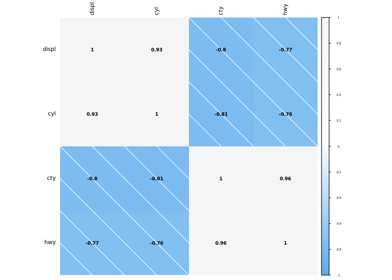
create_gh_style_corrplot(numeric_df,2, "steelblue2","black", "black")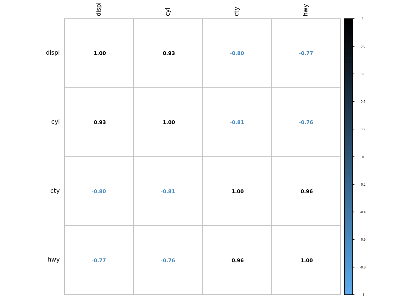
create_gh_style_corrplot(numeric_df,3, "steelblue2","white", "whitesmoke")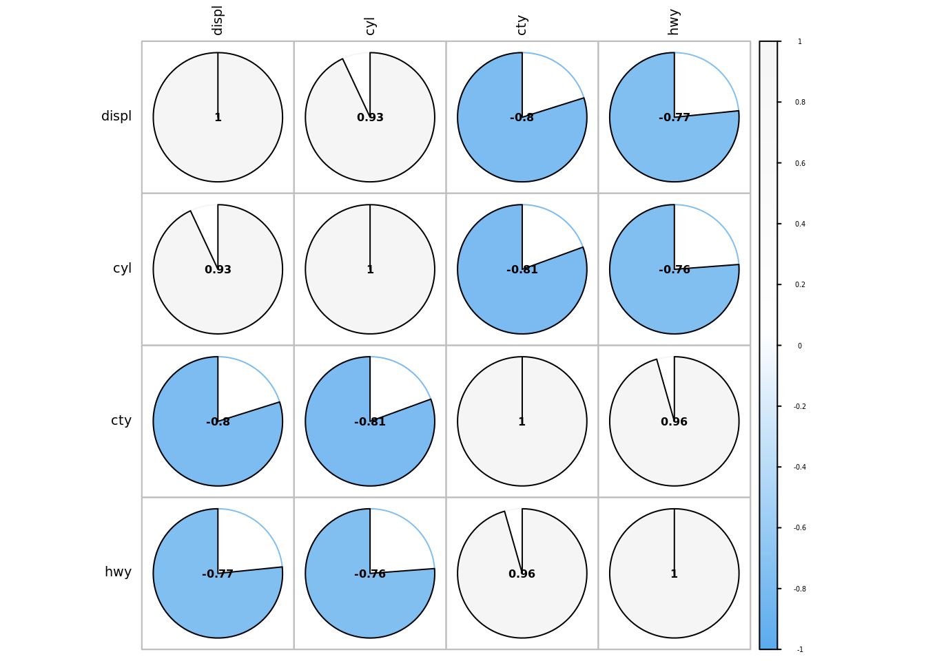
create_gh_style_corrplot(numeric_df,4, "steelblue2","white", "whitesmoke")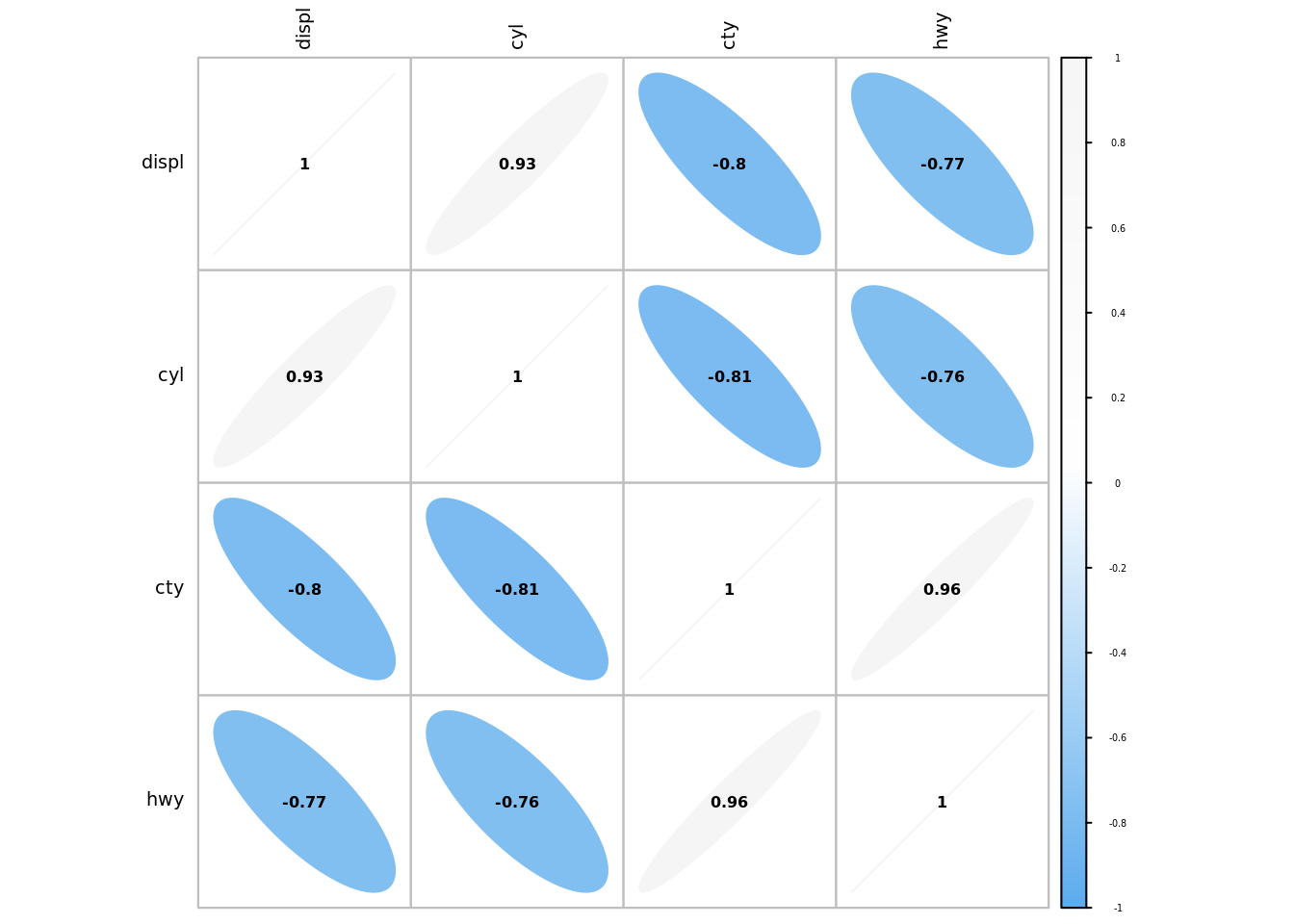
create_gh_style_corrplot(numeric_df,5, "steelblue2","white", "whitesmoke")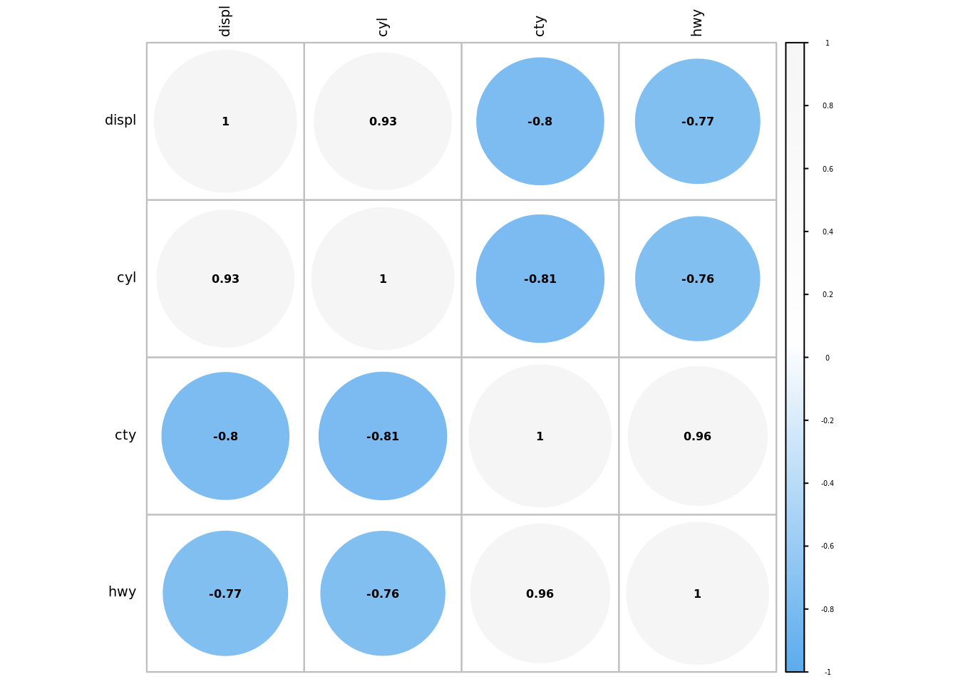
Each plot can be tailored to suite your needs. I tend to like blue shades, but go all out and choose whatever colours you like. The R source code is accessible on GitHub.
I do hope you will use this function to maximise your correlation plots – its all about relationships!
This blog was written by Gary Hutson, Principal Analyst, Activity & Access Team, Information & Insight at Nottingham University Hospitals NHS Trust, and was originally posted on Hutson’s Hacks.
This blog has been edited for NHS-R Style, formatted to remove Latin Abbreviations and to ensure running of code in Quarto.